Date
Words
Elliott MoodyBriton Smith details the creation of Family Type's first variable typeface, Universal Sans
New Zealand native Briton Smith co-founded London-based design studio OMSE alongside James Kape in 2016. He led the studio’s type design under the name OMSETYPE, creating a wide range of commercial and bespoke typefaces including the sans serifs Athletics and Modern Era. However, as OMSETYPE grew, Briton’s work began to demand its own identity and he has therefore moved on to launch Family Type as its own entity, with the innovative variable typeface Universal Sans leading the way.
EM Hi Briton. So, OMSETYPE has become Family Type. Why the name change?
BS OMSETYPE was an offshoot of the design studio OMSE I co-founded a few years back with a longtime collaborator James Kape. I had been designing type for a number of years and we started integrating custom type into our projects, then launched OMSETYPE to sell licences for some typefaces. The type side of the business grew and we decided it made sense to split them up as we had different areas of focus – I’ve left OMSE to create a separate entity just focusing on type called Family Type!
EM How did you learn to make typefaces?
BS I’m self-taught so just through a lot of practice and consuming any resources I could find in print or online. Also through working with some people in the industry who had undergone a more typical type design education. It’s definitely a case of just creating as many typefaces as possible and learning from your mistakes but it takes a long time!
I would also draw a distinction between the design and production aspects of type design, especially when creating a typeface for body copy rather than just a display face. The design and production aspects require quite different skill sets but the end result is a much better product if they are worked on together rather than independently. The early stages of designing a typeface is very conceptual and creative – sketching letterforms and exploring how design features could work throughout the typeface – but then the real work begins with the long and technical process of refining the designs, extending the character set out, developing additional weights and styles, then finally mastering the typeface. It requires a lot of dedication and perseverance! I like to think the conceptual stage only accounts for 5% of the time required, while refining the designs and mastering it into a finished product can account for 95%.
EM Congratulations on the launch of Universal Sans. What’s it all about?
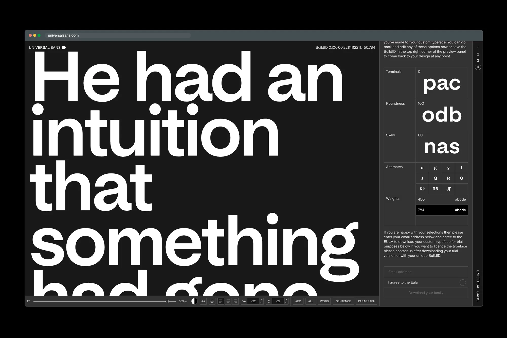
BS Universal Sans is an idea I had been playing around with for a while – could I create a system that allowed for typeface customisation on the fly? Custom type design can be a time consuming and expensive option which makes it prohibitive for most projects. Even just customising a few characters to make it unique can sometimes be a long process. I envisaged a way for designers to customise the typeface online with a selection of variables and alternative characters, then download a version that was bespoke for their project. It also was designed to be engaging to use and help people better understand the relationships between different characters and how they impact the overall design.
A big challenge for the project was designing the underlying typeface that could withstand so much customisation. I wanted to make sure the typeface looked good and functioned well at any combination of variables so it needed to have fairly narrow parameters to prevent any outcome that would break fundamental principles of type design. That led me to experiment with a sans serif system and ways I could create one base framework that I could tweak to get stylistically different results.
EM Were any typefaces influential in the design of the underlying typeface?
BS I was influenced by Adrian Frutiger’s work on Univers and Frutiger which were hugely important typefaces and sit at opposite ends of the sans serif landscape yet still share some common characteristics. Akzidenz Grotesk and Helvetica were also sources of inspiration as were Neuzeit and Unica which both sought to combine elements of different sans serif classifications and styles.
A big part of the project was the initial exploration of ways I could connect neo-grotesque, geometric and humanist characteristics within one design space and creating the underlying typeface that could take on various characteristics without becoming a Frankenstein. Creating a framework that would seamlessly adapt across that range created many limitations but I think that also makes the end result more cohesive and robust.
Many of these initial sources of inspiration are from a different era, yet I wanted Universal Sans to break new ground in both stylistic and technical respects, so the typeface has other unique variables and characteristics that make the typeface more contemporary. One intriguing aspect of Universal Sans is that with all the stylistic variables you can easily discover surprising variations that would have previously required drawing out the typeface in a sketchbook. Universal Sans covers a limited range, but within that range are infinite unique variations.

A big challenge for the project was designing the underlying typeface that could withstand so much customisation.
EM Can you give us insight into the process of creating a variable typeface?
BS Creating a variable typeface is fundamentally the same process as designing a regular typeface family. You design the extremes or masters and then interpolate the instances in between. This is actually really old technology called multiple masters. The design process hasn’t changed so much but the format and support for these in browsers and software are recent developments. Where it gets different and much more complicated is when you add a large number of axes, previously typefaces would usually only have two or three axes – for example, weight, optical size and width – all with accompanying italics. Variable typefaces open up the possibility of having more axes, however, each additional axis multiplies the size of the typeface and time required by a factor of two. So if you have four axes then that would require sixteen masters, five axes would require thirty-two masters, and so on. Universal Sans has four axes but actually required forty masters because some of the axes were non-linear and required additional intermediary masters. Things can get very complex very quickly!
I think one thing to consider when designing a variable typeface is what aspects are variable and what is the purpose of making them variable. Do different instances have different functions? Is finer control is needed over the variable by the user? Or is the variable intended to smoothly transition in animation or other applications? Whatever the purpose the typeface needs to work at all instances and not just at the extremes.

Universal Sans covers a limited range, but within that range are infinite unique variations.
EM Are variable typefaces the future?
BS Variable type has a lot of promise and I expect we’ll see a lot of innovation and experimentation in this space. They are very useful for digital applications where they can be used for animation or interactively, but I think they have proved less useful for static applications as often users don’t need such fine control in layout applications and using a variable typeface consistently can be a challenge. They are also not yet supported in many programs which can make them harder to distribute but as things catch up this will become less of an issue. I think there will always be static typefaces as they are easy to master, distribute and use consistently but also because not every typeface needs to be variable.
TBI There seemed to be a flurry of variable typeface launching alongside the latest Adobe update that brought in the technology to use them. Was that the case with you?
BS My focus has been more on creating variable type for creative applications rather than for use in layout applications. When using variable type in InDesign or Illustrator you are essentially just selecting one static variation and at that moment much of the potential benefit of it being variable is lost, while in digital applications the variability is part of the experience. This was one of the insights behind Universal Sans where you experience the variability on the web application then download and apply those variations consistently in programs like Illustrator or InDesign where often you don’t need more than a couple of different variations in one design.

EM Augmented reality has become a big part of your commercial output. Do you think the rise of that technology will impact typography and the way it’s created?
BS Augmented reality is super interesting and we’ve done a lot of work looking at how it can be combined with typography. AR is a lot of fun as it combines so many disciplines from motion, spatial and environmental design, typography and graphic design then programing and development to bring it all together. Creating typography that adapts to different spaces or viewpoints is something totally new and has a lot of practical applications. A lot of our experimentation has been looking at ways to apply typography stylistically and how far to integrate the type into the environment. At one end you have more VR typographic applications which can be really engaging and out of this world and at the other end more practical integrated AR applications. The work we did for Printworks focused on creating these immersive portals that are almost VR scenes in an AR environment.
I think it will also have a big impact on how type is created however so far this has been limited due to technical limitations. There will be lots of exciting ways to use variable type in AR but so far there has been limited support for the format in Unity and other software we use to create the AR applications. Once that support arrives, I think things will really kick off and people will start designing typefaces with AR in mind.
EM What else do you have in the works at the moment?
BS This is version 1.0 of Universal Sans and I intend to develop and improve it further in the future. Also working on Universal Serif, although that is a long way off! Then there is a backlog of typefaces to complete which we will be launching on the new Family Type site soon, continuing work with Printworks on new AR material and then finally other custom typeface commissions.