Date
Words
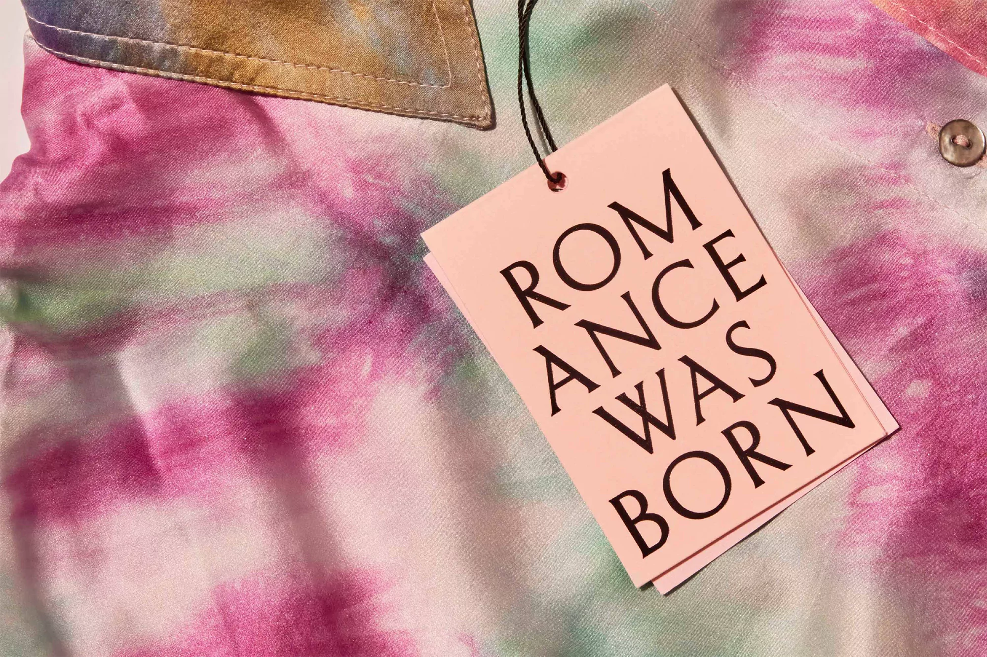
Harry BennettMAUD’s typographic identity for Romance Was Born builds tension between flamboyancy and function


Australian design studio MAUD have worked with contemporary fashion house Romance Was Born on the development of their identity; the result of which is an exuberant, typographic graphic language. Already making a name for themselves through appearances at international shows and museums – the brand is sharing space with some of the industry’s biggest hitters, including Burberry, Balenciaga and Saint Laurent.
However, Romance Was Born’s new identity stands in typographic opposition to the ‘san-serification’ of these brands, with recent years seeing pragmatic san serif wordmarks replace their more decorative and typically luxurious lettering. Having developed a bespoke flared serif typeface, MAUD’s Editorial Director Camilla Belton tells us how its original inspiration came from the book cover of a Phaidon publication covering Romance Was Born. “It used an extremely flared serif that RWB were devoted to,” Belton adds, “so we started from this point, investigating letterforms that could be redrawn to have more extreme forms,” embodying the attitude and sensibilities begging Romance Was Born.
The result is a wordmark that is confident of what it represents and is unafraid to go against the grain. Balancing function and flamboyance, it has a clarity and conciseness that plays into the contemporary attitude of luxury fashion as well as an unmistakably high-end and timeless tone – something mirrored in the subsequent execution of the brand. Championing the wordmark across the brand’s applications, its implementation has a permanence to what it touches; bringing simplicity and sophistication that almost seems historical, referencing hand-carved stone lettering and gold-leafed plaques.
Without seeming old-hat, however, the brand is vibrantly kept in the 21st century through the continuous inclusion of its lead colour. “Pink embodied Romance’s character, creative spirit and whimsy,” Belton concludes, “we washed it throughout all their packaging to give a special touch and romantic flavour to all their communications,” cementing Romance Was Born as a marvellous mixture of the old and new, without pandering to either.
| Graphic Design | |
| Share |