Date
Words
Elliott MoodyCarla Palette turns up the volume with her loud identity and packaging for CBD brand Nebula 10


Created in Berlin, Nebula 10 is an organic CBD beverage brand targeted at consumers “with an appreciation for alternative culture.” In trying to appeal to this intentionally niche audience, the founders of the brand turned to Berlin-based designer Carla Palette for help with their identity and packaging; resulting in a bold graphic solution that takes cues from magazine design and fashion culture.

The centrepiece of the identity is its wordmark, which is set in German type designer Hubert Jocham’s Matrona – a chunky display sans serif that he describes as “a very very very bold headline” font. Not satisfied with its off-the-shelf appearance, however, Palette tells us that “the letterforms were customised to create more space between the letters,” leading to increased scalability and legibility. The wordmark is supported by the elusive Compasse W01 Bold for small headlines, and Monotype’s Helvetica Now for functional components such as body copy and nutritional information.


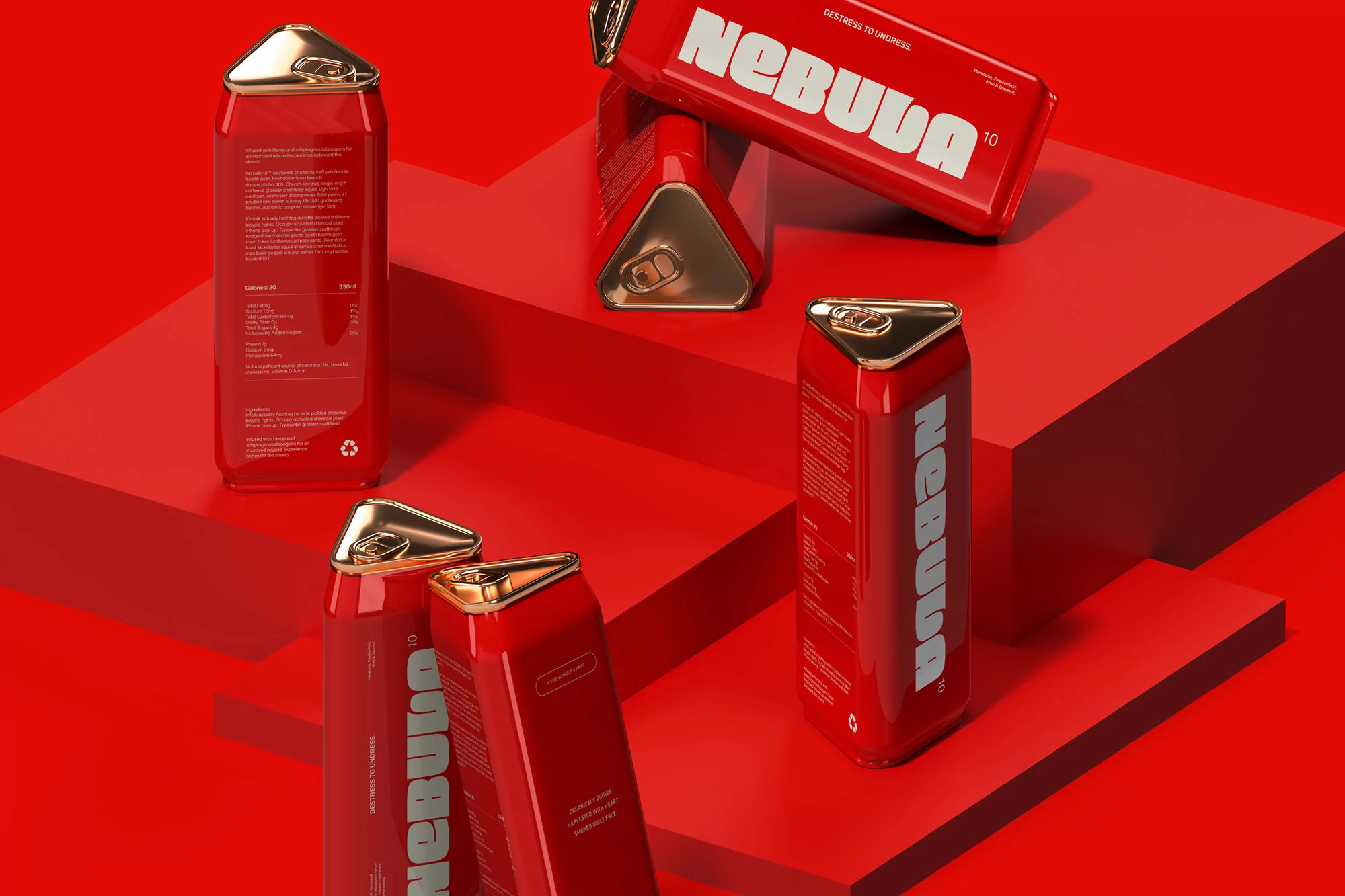
Adding to the weirdness of the wordmark and contrasting with its roundness is Nebula 10’s unconventional triangular can design, which is rendered in conceptual 3D form for the sake of the case study. “We were trying to find a way to cut through the noise of the overpopulated market,” Palette explains, adding that they were hoping to “create a unique packaging style for the brand that’s ownable.”
The battle for attention in the overcrowded drinks aisle is only getting more difficult, and Palette Palette’s colour choice is another attempt to beat that challenge; on top of the already audacious wordmark and can design. “The bright red is used to grab immediate attention,” she reveals, and was chosen to reflect “the idea of creating vices that are both satisfying and form healthy habits.”
| Graphic Design | |
| Typography | Compasse W01 Bold |
| Share |