Date
Words
Poppy ThaxterMojo Supermarket mark 10 years of Girls Who Code with a y2k and nostalgia-focused aesthetic
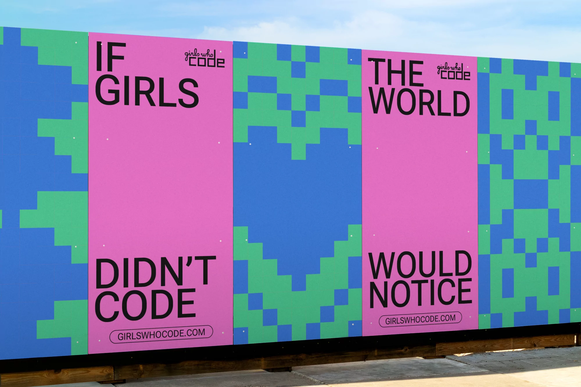
2022 marked the 10-year anniversary of Girls Who Code, an international non-profit organisation whose mission is to get more young women, girls and non-binary individuals into the coding and tech fields – an industry that has long been dominated by men. Marking the occasion, Girls Who Code reached out to New York-based agency Mojo Supermarket to devise a rebrand that would not only give the brand an update, but would also galvanise the next generation of female and non-binary coders.
Drawing upon pixel art from the y2k era, the new look – nostalgic yet future-facing – pays homage to the early days of the internet and the ‘DIY-coding’ associated with forums, message boards and blogs of the early 2000s. Other changes include a typographic shift to Roboto Flex, a Google typeface system that offers a wide range of width and weight variations across multiple optical sizes. “Girls Who Code used Roboto as their main font before the brand refresh, and recently the Roboto font had an update,” Art & Design Director Camilo de Galofre tells us. “As a result, we decided to go with the new, updated Roboto – Roboto Flex.” As a more playful and entertaining direction, “this is exactly how we are positioning coding to our target audience,” de Galofre adds.


Whilst a new typographic and aesthetic direction has been introduced, eagle-eyed viewers will notice that the logo remains the same. “The current Girls Who Code logo is fairly new to the brand, so the client wasn’t looking for a change,” de Galofre reveals. “Although we ultimately decided to leave it as is, we did explore adding a pixelated aesthetic to the logo. We realised that in communication mediums such as print, it could look like a mistake – as if the logo was pixelated – especially in small placements.”


Continuing the flexible approach of the identity’s typography, Mojo Supermarket also updated the colour palette with three primary colours and two secondary colours. The primary – teal, cobalt, and purple – can be combined fluidly with the secondary colours – pink and orange – in varying combinations and proportions.
| Graphic Design | |
| Typography | Roboto Flex by Font Bureau |
| Share |