Date
Words
Erkin KaramemetDesigning in squares: Erkin Karamemet takes us on the historical journey behind his Modena typeface
This is a guest article by Erkin Karamemet, translated and with a brief historical overview by Ferdinand Ulrich. Modena is the latest attempt in a brief history of Latin letterforms that firmly sit in a square shape, and it is Erkin Karamemet’s first typeface in a wide range of widths for different weights. Here he shares some of the observations and careful consideration that went into the design process of this genre.

[1] Modena’s capital O nearly fits the diagram of Lamé curves. While the width has been adjusted using variable font data, its curves dynamics approximate the value of n = 3.
FU Contrast and tension are prerequisites in the graphic arts, in visual communication, and in the anatomy of a typeface in particular. The idea of fitting oval shapes as closely as possible into a square framework has been explored by different designers. While some came up with results that resemble a square with round corners, others tried to maintain a tension that firmly sits just between an oval and a square. The mathematical description of this position was made in the nineteenth century by Gabriel Lamé [1], hence the name ‘Lamé curve,’ but it was the Danish mathematician and poet Piet Hein who famously applied this principle in different design disciplines. In an attempt to establish a new square in the city centre of Stockholm, a roundabout with a fountain in the middle known as Sergels Torg [2], Piet Hein’s design solution of a round shape positioned between square and oval popularised the so-called ‘super-ellipse’ in 1959. In architecture, this principle was also applied to the Estadio Azteca in Mexico City [3] and to the 1970 US pavilion in Osaka. Piet Hein continued to use it in a range of designs, from lamps, carpets, kitchen utensils to the ‘Super-æg’ and the popular dining table that offers everyone an equal seat at the super-ellipse.

[2] Square with a roundabout in Stockholm: Sergels Torg, named after the sculptor Johan Tobias Sergel, follows the principle of the super-elipse. The shape was suggested by the Danish artist and mathematician Piet Hein through contacts with architect David Helldén in 1959 © by Anders Bengtsson.

[3] The Azteca Stadium in Mexico City, also known as ‘The Temple of Mexican Football’ where many round objects have been put in the back of rectangular shapes. Designed by Pedro Ramírez Vázquez and Rafael Mijares Alcérreca, 1966. © H. William Tetlow.
FU Early examples of a similar tension explored in letterforms can be found in Italian type designs of the late 1930s. Alessandro Butti, who had been type director of the Nebiolo type foundry in Turin since 1936, explored it in the contrasted Roman face called Quirinus, dated 1939, and three years later in the contrasted sans serif Hastile Nero. The ‘squarish’ look was revisited at Nebiolo in the only-caps typeface Microgramma, a sans serif design with less contrast, released in 1952. As has been pointed out more recently, it was Butti who initially designed this face by ‘squaring the curves,’ while Aldo Novarese added lowercase and condensed styles to what became known as Eurostile in 1962 (see Alessandro Colizzi’s 2018 ATypI talk). As a result of these explorations, Novarese referred to the square as the ‘predominant shape of the twentieth century’ (Alfa-beta, 1964/2020, p. 251).
Hermann Zapf began working on a durable typeface for newspaper reading as early as 1948, released as Melior by Stempel and Mergenthaler in 1952. According to Zapf, ‘the idea was to facilitate an eye-guiding effect by designing shapes based on an oval fitting as closely as possible inside a rectangle’ (Alphabet stories, 2007, p. 30). It appears that Zapf was not familiar with the mathematical concept of the super-ellipse at the time and may have discovered the shape independently. However, he later cited Piet Hein’s 1965 article, claiming that it was helpful in understanding the ‘general principle of Melior,’ in promotional material of its phototype version in 1966. Zapf revisited the same principle in Marconi, notably the first commercial, all-digital, original design for the Hell Digiset typesetting machine in 1976. Although Marconi has higher contrast, the super-elliptical shape is maintained in its wide appearance, especially in the round letters. These anecdotes show that while some designs built on previous ideas, others are thought out fresh, but they all explore oval shapes within rectangles [4].

[4] From left to right, reproduced from their original metal type versions: Quirinus, Melior, Microgramma and Eurostile, and Modena from numerical curve description.
EK The design of Modena is based on a personal interest in exploring this genre under the aspect of developing a large type family of different weights and widths that can be used in a variety of applications and media. Having previously focused mainly on sans serif designs due to a preference for certain visual expressions, the examination of various genres eventually led to an enthusiasm for types derived from the super-ellipse. This search for shapes was met with a concern in carefully developing a system of weights, with an emphasis on the width parameter. In fact, the convergence of different widths in one type family became a key task in the design of Modena.

[5] Laser prints from the process, above: test words of ‘untitled no. 7’ better known today as Modena Ultra Expanded; below: the original design space (y = weight, x = width) reveals an unadjusted emphasis in the most compressed and boldest area that falsely appear bolder than all other weights.
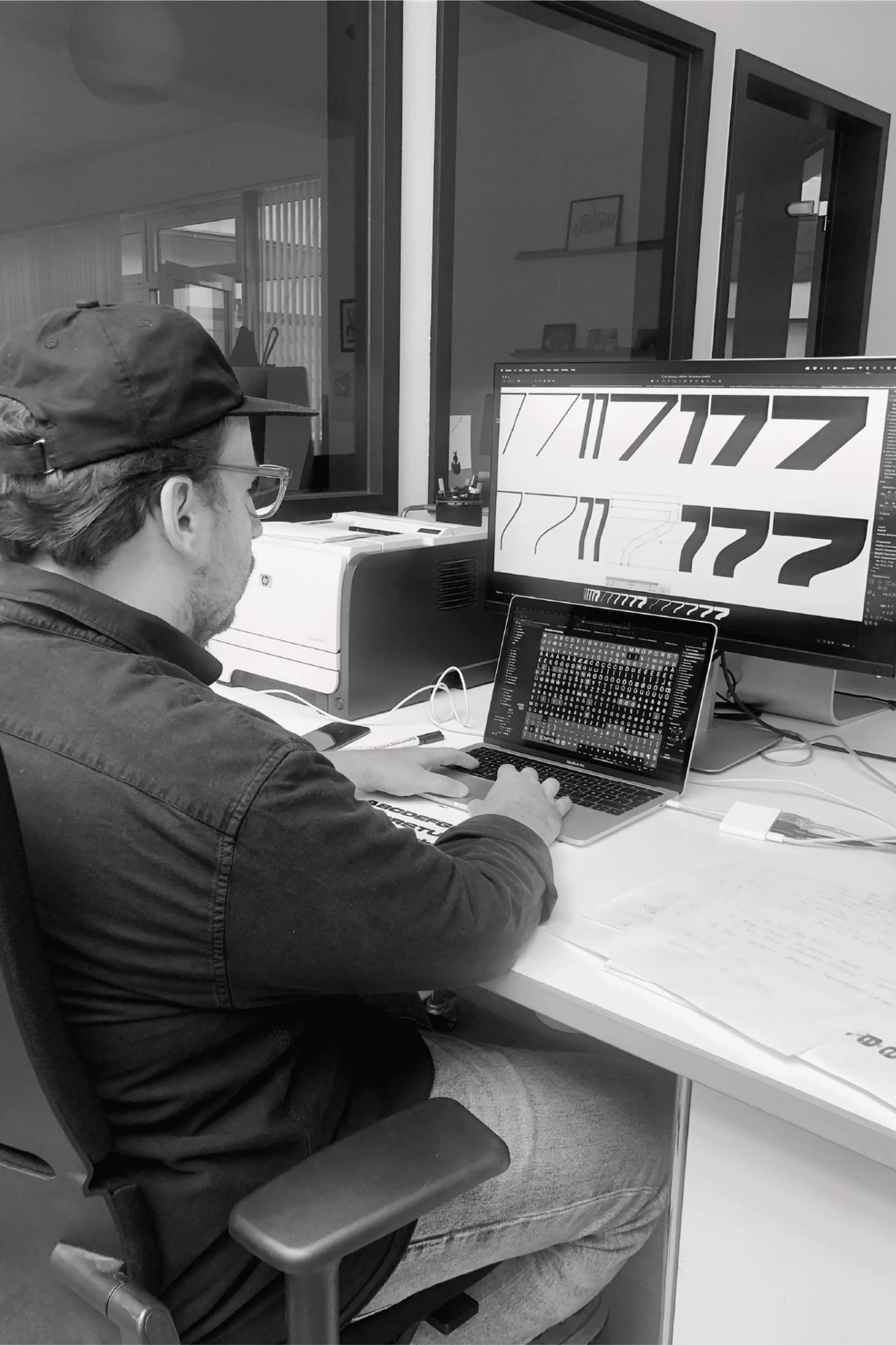
[6] Cologne at night: Erkin working late on alternatives of figure 7. Eventually, the swashed versions were discarded in the process.
EK After several (typically unnamed) attempts at the experimental stage, the seventh draft produced a wide ultra-bold weight [5], which became a starting point, unpretentiously called ‘untitled no. 7,’ for a series of different widths [5]. At that stage, there were of course still several alternative characters that did not make it into the final design [6]. With the decision to produce different widths including compressed weights, it became necessary to include so-called ‘plateaus,’ the section where the curves meet from both ends. There was no intention to develop condensed styles without such plateaus, as had been done in Quirinus. The idea was to achieve sturdy shapes that cultivate a vertical-oriented, compact posture, as can be found in traditional advertising – an appearance that could only be preserved by adding plateaus [7]. The key characteristic of a super-ellipse sits in the curve dynamics of its shoulders: a vertical transformation of this shape does not alter its perception as much as extreme deformation. In the end, optical compensation is necessary, comparable to the adjustments carried out in a geometric sans serif that feels constructed, but is not mathematically geometric.

[7] Anatomy of Modena exemplified in the capital O: an increase of the plateaus from expanded 1, extended 2 and Modena’s normal width 3 to condensed 4, compressed 5 and super compressed 6.
EK One of the intentions in designing Modena was based on the exploration of an expanded design space, particularly in moving towards the extreme ends [8]. Another goal was to provide this wide range of styles in a variable font format. Older examples of this type genre were typically not equipped with hairline and extremely heavy-weights such as ultra-bold, both of which were drawn for Modena. At the same time, all of the available weights were carefully considered from all the possibilities within a previously devised design space. Similar to the first 21 variations of the original 1957 release of Univers, not every upright weight is complemented with a corresponding oblique. Monospaced styles are only available for a handful of weights. Whether a weight appears useful, became our credo of a carefully selected palette from the available design space. The result is a diverse range of styles and weights. Some characters take slightly different shapes, while preserving the overall appearance of Modena [9].

[8] Careful consideration led to a clearly defined design space of six widths (y-axis) at eight weights (x-axis).


[9] The many faces of Modena, from left to right: super compressed, ‘normal,’ italic (oblique), mono-spaced and expanded.
[10] Comparison between the super-compressed and expanded widths of the heaviest ultra-bold weight of Modena reveals a significant weight-loss.
EK Matching the weight gain of different widths across the family from super compressed and expanded became a proper challenge. The comparison here emphasises the contrast that could not be further apart [10]. In accordance with an optical correction, the harmonisation becomes significant especially in heavy weights, while lighter weights require less intense adjustment. Consideration of the width parameter, while adjusting the overall range of weights, adds to the complexity of this procedure: a super-compressed ultra-weight is therefore lighter than the expanded ultra-weight many times over. Much of this evolved in the process – a trial-and-error experience of a challenge that others have of course solved before.


[11] In order to preserve the characteristic shapes between proportional and monospaced styles, some letters remain unchanged.
[12] The italics in Modena are obliques and feature both the double-storey ‘a’ as well as the iconic schoolbook ‘a.’
EK Stylistic alternates have been available in typefaces since the metal type period. This is no different in Modena: several alternative shapes are offered in an attempt to quickly change the appearance for a specific context. Some of these changes result in exciting transformations [11].
‘Obliques versus italics’ is an old sans serif debate that is somewhat continued in Modena. Because of their separate origin, italics can completely change the appearance of the upright style. This can be prevented by concisely slanting the characters, a procedure that lends Modena a sporty look, true to the eponymous town in northern Italy known for its sports cars and racetracks. Traditionally, these resulting weights are referred to as obliques. While it is important to keep oblique shapes noticeable, this characteristic is best achieved through the angle of slanting, but rarely in the transformation of shapes. The angle of 15 degrees follows Adrian Frutiger’s comments of wanting to achieve a ‘snappy’ companion to the upright weights of the phototype version of Univers, although he even went a bit further than 15° (Osterer & Stamm, Adrian Frutiger: Typefaces, 2014, p. 102). Frutiger’s obliques earned some criticism of being ‘on the verge of falling over’ – just the kind of snappiness that is intentional in Modena [12]! To add to the confusion, the fonts of the oblique designs are named ‘italics’ in Modena (and in many other typefaces these days).

| Typography | |
| Share |